


I kept the design really minimal and straight to the point as I am not a web designer; I wanted the work shown to be what represents me as a designer as a pose to the design of the website. It looks really professional as I used SquareSpace which allows you to create something well designed, easily editable and effective for displaying a portfolio.
I used the font Chivo as this has become part of my new brand identity this year; used in my portfolio, CV and business cards so I kept my website consistent with this. I used the colour yellow throughout as its also part of my brand identity, featured in my 'profile' image, CV and all of the links featured on the website.
I also included my gif logo in the top corner so that it links clearly to all of my emails and people know they have reached the right web address.

I set up the home page so that when you hover over each project image it automatically swatches a colour from that image; and creates a hover over with the pages title. Its a simple addition but looks really effective and well considered when using the site.


This is what one of the click through work pages on the site looks like. I chose to use full spreading images so people could really appreciate any detail in the images and its really immersive to view. Then smaller additional images at the end just to give some context and more views of each project. I also include a small description of each brief.
The site features links to all the other briefs at the bottom for ease of navigation.
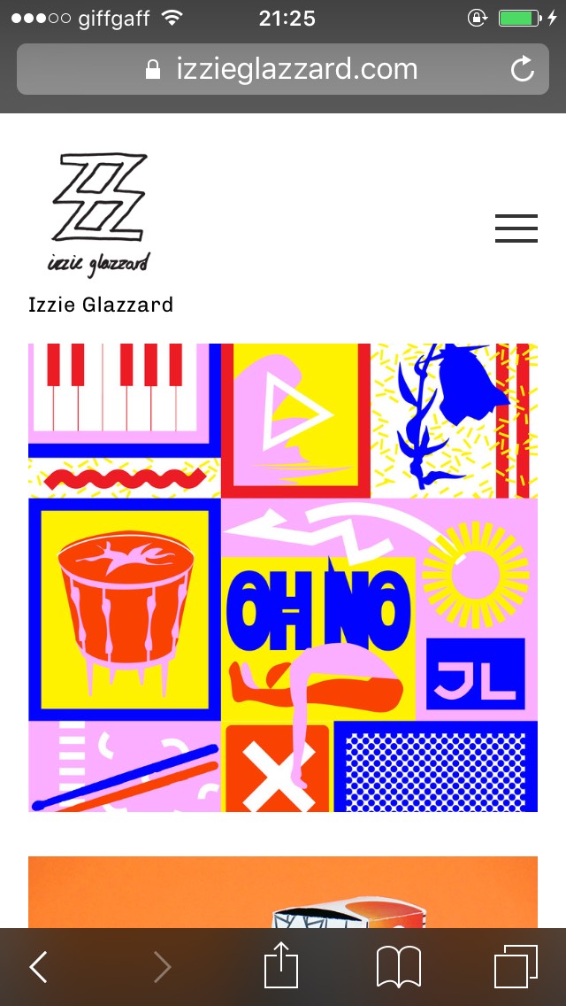
Because I chose to design my website using Squarespace it means all of the templates are already compatible with mobile usage also; so I know i'm not limiting anyone who might want to view it. This image shows how the home page looks on mobile

This image shows the hover over coloured title in mobile.

How a project looks on mobile.

And last but not least, the navigation tab on mobile.


An important feature of my website was to include an about page; it's basically an online compressed version of my CV. Allowing people to see my employment experiance and all the exhibitions i've taken part in. It also has quick links to all my forms of social media and a contact form button which links directly to my work email. I also featured images of myself just to put a face to the name; I want to be memorable.


Another important addition to my website was my animated manifesto which has it's own page. Each animated is full spread as I really want to get the message across of exactly who I am and what I expect from other people in respect to working with them.

The last page i've created so far is the links page. This will include any links to other social media, online presence and anything I feel is relevant. This image shows a quick links panel to LinkedIn, email, Behance and Instagram.
I have also synced my Instagram feed live to this page so as I update that will work that is in progress that part of the links page will stay updated.

Another parts of my links page is my PDF portfolio. I have created an Issue virtual publication of my portfolio and had this embedded into the links page.

I have also embedded my creative report that I did with Alphabet to show my engagement with studios. I will continue to embed any publications I do in the future and this might even become a page for itself eventually.

The last thing on my links page is quite simply links - links to the relevant people/websites of people I have worked with and clients of mine as this displays my work in its actual context.
No comments:
Post a Comment