The next thing we needed to consider was the actual form and packaging that the drug would take on. We had already decided it would be in a liquid form but didn't know weather that would be a drink or something much smaller and direct such as a dropper bottle.
We discussed further and we wanted this product to become something a buyer would use every day and really integrate as a part of their life rather than just something that would be a drink bought on a whim now and again.
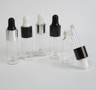
We decided to form 2 types of packaging; a dropper bottle and the outer box packaging.
As each of us had produced an individual pattern/design which we felt represented the given personality type it meant this would be the main feature for each drugs packaging. We discussed the idea of having the liquid inside the dropper itself being orange so this would become part of the brand identity itself as it follows the colour scheme.
We felt because of this orange liquid being an iconic part of the overall identity it needed to be seen within the bottle itself - so we chose to produce clear bottles with clear printed labels featuring each pattern on them; the white areas allowing the customer to see the contents of the bottle.
We would then create a small, tall format box to house each bottle so they would look complete and bold on the shelf; we wanted them to sit next to each other and look like a set but still individual in their own right.
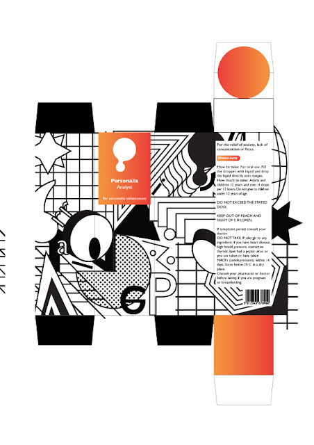
This is my final design for the packaging and overall identity - it works well and perfectly meets the specific brief for the analyst personality - Structural, avant garde, architectural and clean this is informed by the personality being innovative and strategic thinkers who are bold, imaginative and knowledgable.
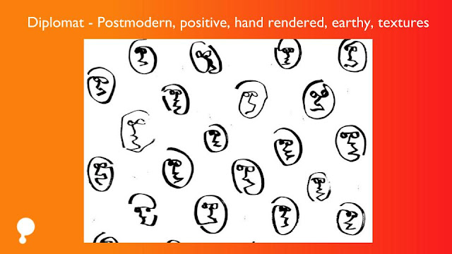
This is Amelias final design for the diplomat design - hand rendered and depicts various faces representative of personality differences and individuality. This being informed by diplomats being poetic, kind and altruistic creatives. Inspiring and eager to help.
This is Taimes design treatment - really minimal, direct and straight to the point of perfectionism. This is informed by sentinels being practical, fact minded and popular. Excellent administrators, unsurpassed at at managing with dedication.
And lastly this is Florence's design; extremely random, creative and kitsch in design style. This is informed by an explorer personality being bold and practical experimenters. Flexible, energetic and always up for something new.
For the design on the bottles we decided we would simple print out clear labels for each with no other information; just let each design speak for itself and let the contents show through and interact with the design. We did consider creating an inverted version of the label but then felt less would be seen through this and it was un-effective to have variations of the design and it was much bolder just as it would be seen on the box and throughout all the collateral consistently.
I personally wanted the design for the boxes to be just the pattern also then have a simple sticker label of the logo with the orange holding it together and making the brand consistent. But the group disagreed and wanted it to be more integrated part of the boxes design so they felt like more of a set.
Amelia took on the job of creating the basic net template for the design. It included the entire inside of the box being the gradient orange that is an iconic part of the brand identity; so that when you open up the box you are instantly hit by all of the orange within the box and the liquid within the bottle.
The box features the logo, product name, personality type and ingredients/measurements.
This is what my design looked like on the final net. As you can see the design completely transforms it and make it my own; each personality becomes its own individual thing and they will look really bold and contrasting from one another - the idea being they will appeal to each personality type in a different and engaging way.
We decided this was a good design treatment that would look bold on the shelf - the high contrast mixture of bold black and white and punchy orange gradient would be sure to capture attention and look quite luxury among competitors as instead of looking boring and medical it looks bold and packaged more like an expensive perfume than a study drug.


No comments:
Post a Comment