

The two most obvious format choices for me are either a simple zine or content based poster as I only have an interview with Alphabet so the content is minimal and it would be nice to include some images of the amazing work that makes me drawn to them as a studio.
Either way i'd like to produce something that can be templated and re-produced for any other interviews I may conduct with studios/artists in the future.
Of course this is really tricky as the aim would be to design something in the style of Alphabet rather than myself; or something that is none-specific and minimal enough to be applied to anything.

I decided initially to make a hotdog book - zine. Seen as editorial and working to someone else style is massively out of my comfort zone I decided to also work black and white and later decided on what stock type would be chosen and possibly add some colour to the design. Working with just black and white is the traditional way to produce a zine and something I have researched a lot throughout the course to feel it appropriate to stick to this historical value and research based ethos.

This is my initial design treatment - using the hotdog fold layout. It very in the style of punk zine culture in that its simple, blacked out areas and heavy in type. But for me it doesn't translate my personal style and how I work very well. Its too messy and text heavy and not like anything I would usually produce.

I also experimented seeing what it would look like once printed greyscale onto a coloured stop but it still didn't represent me well enough - I needed the design to be a balance between me and alphabet and considering much of their design is very minimal this design does neither.

I decided due to the large amount of content it needed to be in a format that was much more spaced out; allowing for more negative space much more iconic of Alphabet themselves.
I felt creating a magazine spread - the kind of thing you might see featured in things like Intern or Creative Review would be more appropriate.


These are some initial layout experiments - but once again I felt there was far too much content for what I was trying to put across. I decided it needed to be one question per page, with a relevant image alongside, this way it could be a small creative report magazine by itself but also act as something that could be an insert in a larger creative magazine.

My first decision was that I would either be printing the background pink or be printing the final publication onto print stock. This is due to the synthesis between my personal practice and the practice of Alphabet as a studio - iconically we both use colour in really bold and tactile ways - its what I like about them as a studio most. Their work features a lot of pink in particular, as does mine, therefore it became the colour of choice.
The title typeface I have chosen is Bluu Next - It has become one of my favourite typefaces over the past year as it is really different and quirky and instantly stands out among other serif typefaces - I feel this is an informed type choice as the ways you describe the typeface itself and the personality it gives off can also be applied to both mine and Alphabets design process. It's not just the ordinary.
The body copy typeface I chose is Sporting Grotesque - Once again a favourite of mine and chosen for its individuality as a sans serif typeface. But much more legible when at a smaller pt size than the latter.

The spread layout has base elements which stay consistent throughout. The first being the name/titles on each page - Izzie Glazzard & Made by Alphabet - This is because all the text/content on the left page labelled with my name is my dialogue/questions within the interview and all of the answers and images by Alphabet will be on the right hand page of the spread.
Secondly the inner page labels, they tell you that this is an interview/creative report, they keep the layout looking balanced, informative and makes a clear split between question and answer.
Lastly the page numbers, the style is informed by that of magazine layouts so this is just standardly consistent with that idea and also keeps balance with the other labels on the page.

Each question is written in the title typeface as this creates a type hierarchy and gives the reader something initial to draw them into the article. This is the only thing that will appear on the left hand pages of the spreads as this is the only content that I provided during the interview.
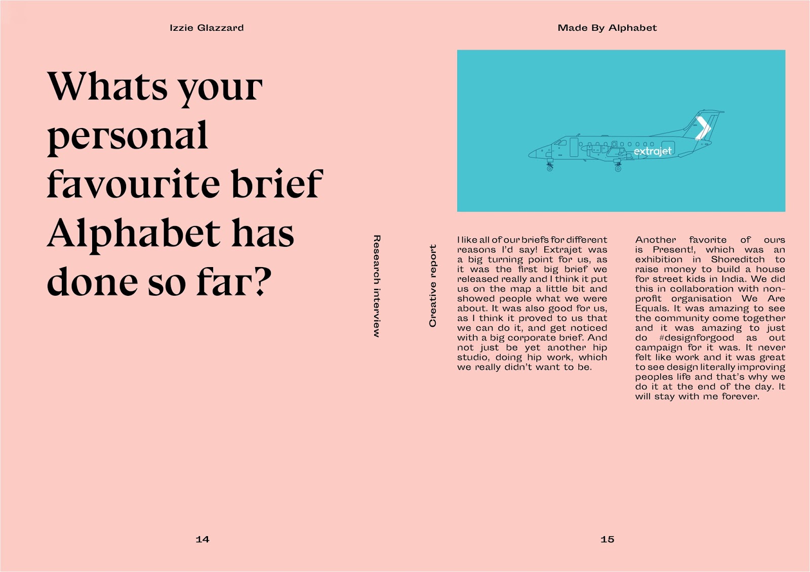
The right side features an image of Alphabets that I personally like and feel fits well within the spread and things being discussed within the interview. The answers are written in the smaller body copy typeface as there is much more content and it needs to be legible. They have been aligned using 'justified' as once again this is informed by the magazine spread standard usually seen. All paragraph/body type has been composed according to amount of text and format of the images - allowing for negative space and a balance between all the elements within each spread.


This design treatment works so much better for presenting this content - it's much more minimal and representative of both mine and Alphabets work - it's clean, balanced and considered. Most importantly I feel this design works well as each decision I made was well informed by the context and content of the brief.
I do plan on printing this publication onto a light pink stock for hand in - but this depends on availability of print slots so just in-case I have produced an Issuu digital version to show what the final publication will look like once printed.
No comments:
Post a Comment