
Your standard and very typical designers business card features a personal brand logo on the front and contact information on the back. This is simple and effective but to me nothing seems to stand out among the competition. So I wanted to go for a totally different approach with my design.

This is my logo design that I developed over the past two years. Its made up of the four z's in my name and it hand rendered to express my illustrative style and animated to show that I am multi disciplinary in my practice. I use my logo design for my website and to sign off at the end of emails; I want it to be present on my business card but not to be the main image as I want something that grabs more attention.
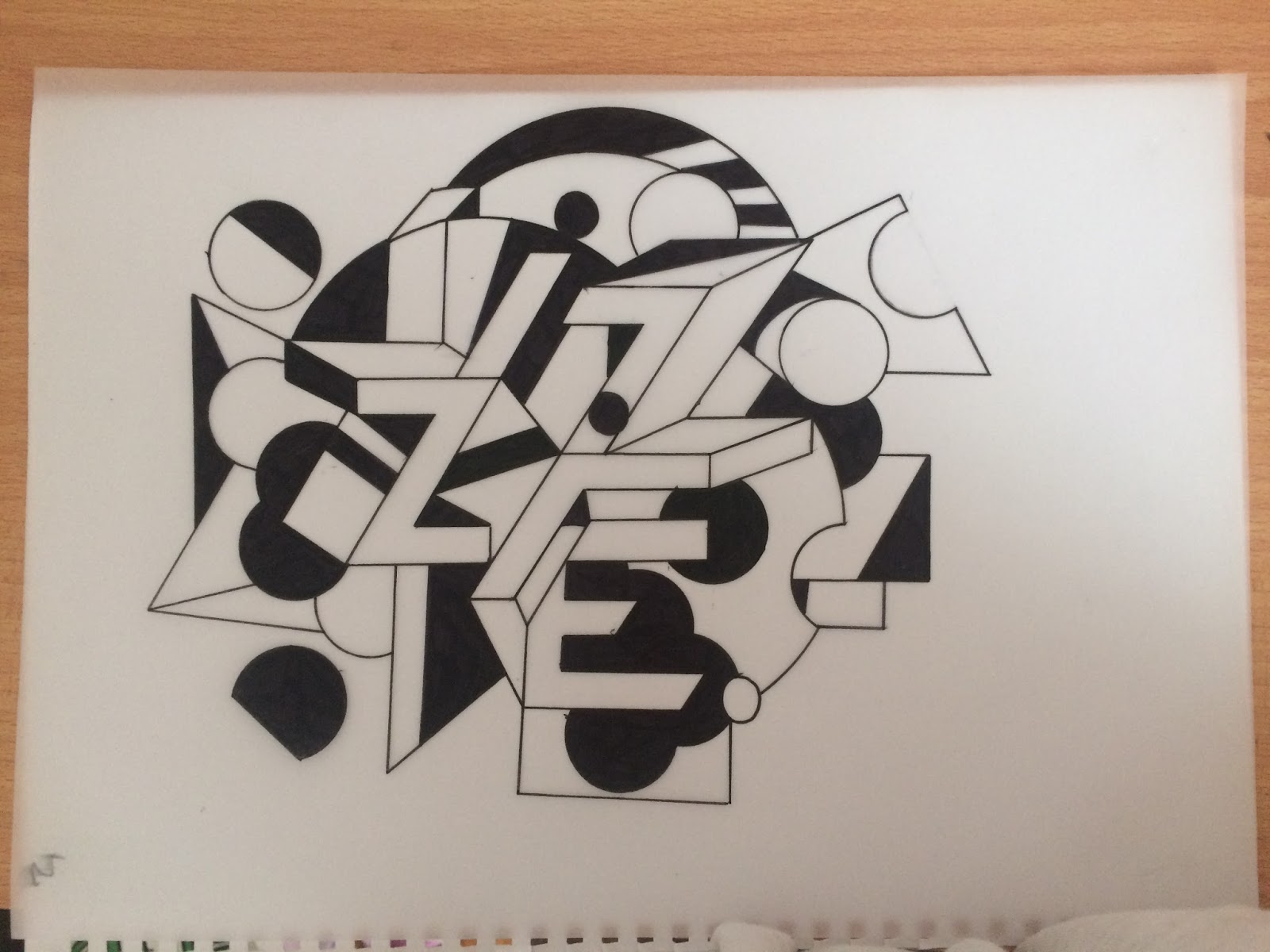
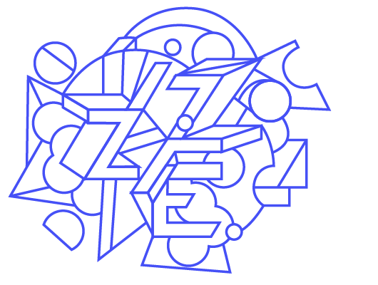
My process for designing my business cards was very hand-rendered to express that I like to work really illustratively so I just began by playing around with written typography and shapes - once again I just let this design process be really abstract and natural as I felt it just needs to represent me so the most organic thing I can produce will most accurately do so.


I looked back at the previous self promotional work I had produced previously to self promote my practice. And the perfect option for me seemed to be the design I produced as an introductory/gift to say hello to potential employees. My Hello print perfectly reflects my illustrative style, interest in type and image and bright colour choices; it simply shows that I am different.

I scanned in one of my screen prints and coloured it digitally on Photoshop to be inclusive of some really bold and bright colours as to me this hugely reflects how I generally work.

I however still wanted to make the most of the previous type design I had done for the cards. So I coloured it in the same gradient as the front design and decided it would form the consistency between front and back.

This is the final design for the back of the business cards. It features the type design in the same colours as the front but slightly faded to allow for the type to be the main focus. Then my logo in the corner just so it links nicely with my website/online presence where a logo is featured. The typeface I use Chivo is the same as the typeface used on my website; I think its simple but has little quirks that make it out of the ordinary in comparison to your standard sans serif - say helvetica - doesn't represent me as its so overused and seen all of the time - I want to express the opposite of this whilst still being legible.
I describe myself as a graphic designer, image maker and creative being - I hate to categorise myself as I work in a very multidisciplinary way but I think this sums it up nicely.


I am really happy with how the final cards turned out - they represent me well, non-conforming, bold and bright. I think they will be a great tool when going to events, networking and to leave in shared art spaces.
No comments:
Post a Comment