Saturday 29 April 2017

~ DBA - Design development ~

Once the concept had been well considered and decided upon it was time for us to start designing. We had come up with a list of design styles/factors which we felt represented each personality type best and each chose a personality (best fitting our own) which we would then produce the design for.

This design would go on to represent the chosen personality type throughout all of the collateral - online, packaging, promotion, other. 

I was given Analyst - 

The list of design styles to consider/follow for this personality type being...
Avant Gard, structural, clean, architecturally inspired 

I was aiming to create something really structural and made up of really simple lines and shapes but composed in a really creative way. It should demonstrate imagination but in a bold and strategic way.

Because the design is a pattern it should be quite abstract and work when cropped to any size/format not to limit its potential for flexibility.

I did some initial research into forms of avant guarde design that I felt were appropriate. It was instantly clear the final outcome for this design needed to be digitally produced rather than hand rendered; it needed to be creative but also show perfectionism.


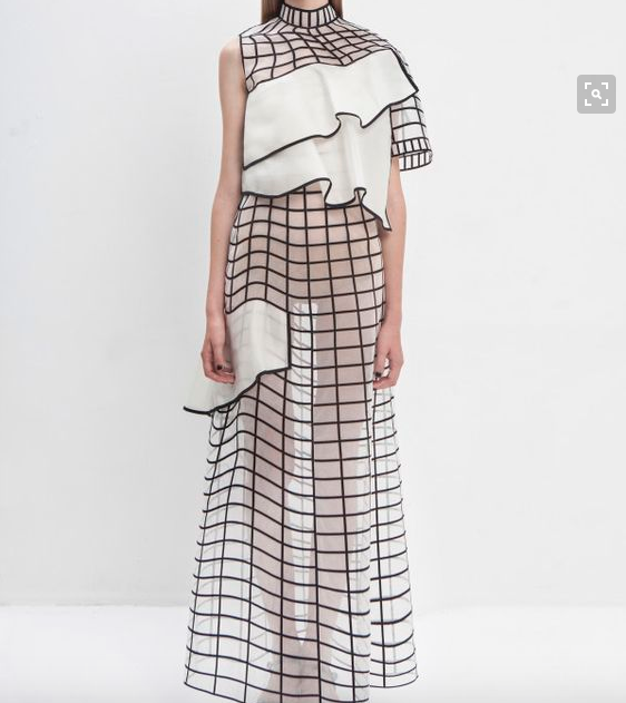
These are a few of the images I collected as inspiration for the design. Themes I noticed - simplicity but complexity at the same time. Bold lines and block shapes, mesh/structural grids, pattern, repetition. 


These were my initial design developments - I decided the symbol of the + was very symbolic and relevant to what our study drug was aiming to do - you + more.

I took the idea of creating something structural, simple and repetitive and created some designs where the + symbol was subtly spinning to creating something quite mesmerizing and alike an optical illusion. 

I did like this as a design as its really simple yet visually appealing. But I identified the issue that it looking like an optical illusion is a negative thing when branding drugs; its suggestive that the drugs could have hallucinogenic properties and this is not something that I want the design to portray at all. It needs to be safe, friendly and appealing. 


I decided to go for something much more expressive and imaginative; but still inclusive of structural elements, repetition and the iconic grid patterns I had seen when researching avant garde design. I used symbols that I felt were simple enough to not produce any underlying of suggestive meaning other than the structural and imaginative nature of those who have an analyst personality. It's simple but not as the same time and thats exactly what I was going for. I also added letters of the name we decided on dotted around within the design.


I experimented with ways of adding in the logo within the design and even the addition of the colours - but felt as a stand alone pattern it worked best and that an overlaying sticker with the logo/label would work best.

It meant I had to pitch the idea of having each of our 4 patterns in black and white only then all of them having a consistent label design which would tie them together into the one brand. The others agreed this would work best as otherwise our designs may not gel together well and could risk looking like 4 completely different brands/products. 


~ Creative report - Elmwood & Music ~

Elmwood - I wanted to keep the questions relatively similar to the ones I had asked Alphabet but edited accordingly - but I wanted to know the same answers but different peoples perspectives on such things. 

Would you say it's possible for young designers to go it along after graduation? Or is experiance necessary?

What advice would you give to a fresh graduate you if you could go back now?

After seeing my portfolio - what advice would you give me in terms of moving forward?

How is Leeds for creativity in comparison to the other sites Elmwood has studios?

How do you kick back and relax when deadlines are looming and workload is high?

Would you say research is more or less important to creating work after university?

Whats your personal favourite brief Elmwood Leeds has done so far?

Music

Would you say it's possible for young designers to go it along after graduation? Or is experiance necessary?


What advice would you give to a fresh graduate you if you could go back now?

After seeing my portfolio - what advice would you give me in terms of moving forward?

How is Manchester for creativity in comparison to other cities in the UK and around the world?

How do you kick back and relax when deadlines are looming and workload is high?

Would you say research is more or less important to creating work after university?

Whats your personal favourite brief Music has done so far?

Email introduction -

Hi guys,

So as part of my personal practice module at university I am conducting small interviews with studios who personally inspire me and I have had engagement with this year. I have put together a few questions and wondered if you could find the spare time to answer them for me?

Thanks Izzie

~ DBA - Concept & logo ~

The initial most important thing we needed to decide on and produce as a group was the name of the brand and logo - to establish the rest of the brand identity surrounding this. 

We threw around some initial name ideas -

Flash
Concentration
Direct
Personality

Then came up with the idea of using the latin word for Personality - this was informed by the idea that this drug was essentially claiming to be quite transformative to your personality and the entire concept was surrounding different personality types specifically. And most drug companies often use words that are difficult to pronounce and latin words. 

So we finally came up with this latin name - Personalis as the final brand name for the drugs.

On to the logo.....


This was an initial logo experiment - trying to visually show the experiance of being able to focus and concentrate on something. 


This idea was just a really simple icon of a head - really basically linking to the concept of the different personalities.

I experimented further with the idea of using a head by creating a full face - tried using that as part of the letter P.


I also experimented with the idea of then taking this head symbol and adapting it slightly to fit in with each personality type. But it felt too childish and only aiming at a very direct audience - and the whole point of our concept is that the target audience is everyone - literally by aiming specifically at people according to personality. 


Some more target/focus symbol logos - I felt they were too hypnotic and had negative connotations of hallucinogenics that we didn't want attached to the drug/brand. 


Some more target ideas - looked too alike a gun target which also has negative connotations.


We had already established the idea that to stand out among other competitors and to avoid seeming to clinical and being 'another pill' to take in the morning that our study drug would come in liquid form. 


So I came up with this logo design. Combining both the drop-cap 'P' for Personalis and the idea that it is liquid; which for the brand would be a stand out selling point that makes it different on the market. 

I pitched this to the group, due to the colour they felt it needed a little bit of editing to avoid it looking too much like the Walkman logo.


As a group we decided this was a good logo concept to choose and developed it into something we could work with. The gradient combines our colour scheme well and it is overall iconic of fluidity and liquid - and in an abstract way it is a successful 'P' dropcap.


~ DBA - Concept generation ~

As a group (Me, Florence, Amelia and Taime) we had a group discussion and initial ideas generation session. 

We initially discussed how we wanted to market the 'smart drug' and what our target audience should be. We considered possible target markets being

- Gamers
- Students
- Surgeons or people in concentration demanding professions
- Older people looking for a feeling of 'youth'

We then went on to discuss how we could be all inclusive of all areas of these target markets rather than limiting the brands reach. We decided variations tailored in 'ingredients' and design treatment within the brand could ensure all markets were effectively targeted. 

I did some research into an area I had come across previously - the idea that within the Human race we can divided into 16 personality types and those into 4 categories - Analysts, Diplomats, Sentinels and Explorers. 

We collectively decided we could use these 4 personality types within our concept and effectively market towards all four. 

Our concept is that each personality type will be given a variation of the drug scientifically 'tailored' to bring out the best concentration, focus and inspiration for their personality. Within this concept we will also identify a design 'style' and theme that matches with each personality and appeals to certain characteristics of such. The overall brand will follow the same basic packaging, logo, typeface, format and colour rules but the design style and wrap around packaging will differ dependent on which personality type it is being marketed towards. The brand/marketing would offer an online quiz in which potential customers could find out which personality type category they fit within and then go on to advise the user on which of the tailored products therefore would work best for them. 

https://www.16personalities.com/personality-types


I used the descriptions on this personality identifying website to inform the decisions into what design styles/aesthetics would be used for each variation of the drug. 

Explorers - Kitsch, erratic, colourful 

Sentinels - Minimal, modernist, simple

Diplomats - Post-modern, positive, hand rendered, earthy, textures

Analysts - Avant Gard, structural, clean, architecturally inspired 

Due to their being 4 of us in the group we decided to take one design each to create a 'wrap around' illustration/pattern/design for our chosen personality type. Mine being Analysts.


We used the website COOLERS to experiment and browse through some possible colour-schemes. We wanted to use colour theory to portray something positive, attractive and not 'corporate' and medical; we felt avoiding dark blues as that is usually associated with NHS and prescription medication. 


We eventually decided on this colour scheme as the monochrome elements allowed for a professional and clean appearance and the warm red and orange were suggestive of energy, power and concentration. We wanted something really punchy and bold in comparison to the market competition which appeared as corporate, serious and medical.


Our final group decision was regarding the marketing for the product rather than the design. We discussed varying ways of packaging/ingesting the concentration 'drug' and how that would effect the brand. We felt traditional forms - mainly pill form was too prescription drug related and could put many potential customers off - particularly for those already taking multiple supplements regularly. 

We came to the conclusion that a liquid form would make the product stand out from competitors and appeal as more of a pleasent experiance in comparison to swallowing pills. Possible packaging formats being, dropper bottle, pour out bottle, individual sachets.

~ DBA - Research ~


When it comes to medication, pills, cures etc. (this sector) everyone has a personal preference dependent on their personal views and personality. Some are more likely to buy cheap pain killers as they care more for value for money and other will buy brand names due to trust, others will be more attracted to certain brands due to branding. One example being Feminax; they are essentially ibuprofens which can be bought cheaply from any shop, but when marketed specifically towards women for period pains women will pay more under the impression that they work more directly and effectively. 

I feel for these reasons the design treatments of the examples shown above are really effective. They offer variations of similar products/pills under one brand name. Each variation could offer a slight difference in effectivity and purpose and branded slightly differently to appeal to a mass market of people with all different visual and personal preferences. 

For these reasons I feel within our branding we need to be inclusive of a mass market rather than targeting a certain group of people. 

http://www.inventivhealth.com/docs/Drug%20Branding%20Through%20the%20Eyes%20of%20the%20Consumer.pdf - I also found this article discussing branding for drugs.

"Not long ago doctors were the only ones driving prescription decisions. But now, patients are better informed and more empowered, causing a shift in the way pharma thinks about branding their medications. No longer do companies just need to speak to a drug’s efficacy, they also need to resonate with consumers, build trust, and most importantly be easily recognized."

"Many of them say, “ask your doctor if ______ is right for you,” pushing consumers to take a more proactive role in their health. As a result, medication brands need to be memorable enough for patients to ask their physicians about it."

The article hi lighted how the name for the drug needs to be memorable and suggestive of empowerment and a real end goal of taking it. 


I collected some examples of existing branding for concentration enhancing drugs. Most of which appear to be very corporate and medical in tone of voice/aesthetic. I felt in order to stand out and appeal to a 'new' and broader audience it was important to create an element of positivity and almost fun whilst maintaining a legitimately professional appearance.

A lot of the examples I researched had different variations of each drug that claimed to enhance different aspects of someones concentration/productivity. This is a point I was keen to discuss with the group. It was important we created an entire brand and considered all aspects rather than designing for just one singular product. 

~ DBA - Brief ~


We were briefed to collaborate in small groups to produce a concept brand identity for a new range/nootropics drug. 

The brief was really simple as we were the ones who had to decide target audience, price range, brand ethos etc. 

It was all about establishing a good way of conducting group work to create a brilliant concept that blew everyone else's out the water. 

My group was made up of me, Florence, Amelia and Taime. 

~ My Manifesto - development ~

I decided a huge part of my personal journey throughout the course and how i've changed is my views on not just graphic design but working and the world in general. And a nice way to bring this all together is by creating a personal manifesto. 


I created this manifesto last year for PPP but looking back its clear I was trying to be over professional and fit into what I thought made a good designer rather than actually being true to myself. This is something that definitely needed changing in going forwards and creating a final manifesto. 

I started by looking at the manifestos of some of the studios that I find appealing and would like to work for myself.


The Snask Manifesto

01/ If you don’t like your job – quit.