Wednesday 5 October 2016

~ Alphabet ~

Alphabet Leeds & Manchester stands out to me massively for internship potential. Their style of work is contemporary, fresh and very alike the outcomes I feel I would produce myself. 


~ Mark ~

Mark is an independent branding and graphic design studio. Since 2005, it has been producing work for clients of all kinds and sizes, winning a fair few awards along the way. Mark likes to keep things simple, works hard to understand a client's business and what makes it different, and works harder still to communicate that difference in the most engaging and effective way.


~ LOVE ~

Love (Manchester) is a design-led agency that takes an integrated approach to storytelling, utilising advertising, branding, digital and experiential to meet its clients' aims. Love believes that design sits at the core of brand success, and seeks to develop visionary solutions that drive conversation and engagement for global brands.


Visually I find their work really appealing, its a broad range of styles and finishes which shows their willingness to experiment. 

~ Music ~

Music studio Manchester is an award winning studio. That focus on fun, target audience lead design. They have an internship scheme already set up which makes it appealing for a future potential placement. 


David Simpson and Matthew Beardsell opened Music studio in the Northern Quarter of Manchester back in 2007, with the intention of establishing a hardworking yet fun-loving environment where creatives would feel supported and valued.
That rationale quickly bore fruit, and Music has since grown into a successful 24-strong team that works across branding, digital, advertising, experiential design and interior solutions, with an original approach being the only pre-requisite for tackling a brief.
"The vibe is hardworking and fun – hopefully a place where individuals feel supported and valued," say Simpson and Beardsell.

~ Creative concern ~

Thinking forward about internships this year i'm looking into studios that interest me due to style, values, project focus etc.


Our ethical approach

Creative Concern is an ethical agency with a strong commitment to continuous environmental improvement and sustainable development. We aim to minimise our environmental impact through good management and by adopting business best practice and greener alternatives wherever possible, throughout our operations. Here are just a few of the things we are doing to reduce our environmental impact.
  • We calculate our carbon footprint and offset our emissions every year.
  • We are a Buy Recycled business and are very proud of the fact we achieved Gold standard in the Environmental Business Pledge scheme.
  • We have even developed our own standards for sustainable design and production. We call it Design for Life.
  • We have introduced low energy lighting to our office environment and use 100% recycled paper in our printers and copiers. We have full office recycling of glass, plastics, metal, paper, card, printer cartridges and CD/DVDs through Emerge Recycling.
  • We use public transport or walking/cycling wherever possible. We are members of the City Car Club car scheme for those trips that require car travel. The car club scheme is a greener, less polluting option that encourages staff to use public transport into the city centre and home again, whilst only using the car for essential trips.
  • We buy our energy from a green supplier – Good Energy. Good Energy is an independent renewable energy company based in Wiltshire. Good Energy’s commitment to its ethical values as well as to promoting and developing renewable energy in the UK has been independently accredited by the Ethical Company Organisation over the past three years.
  • We are a founder member of a European network of agencies focussed on sustainable development communications called DNS.
  • We have also developed a trusted partnership with Faelix web hosting, a local web hosting company with strong environmental credentials, that utilises low energy technology.
Creative Concern is an active supporter of a range of environmental and ethical causes. This has included contributing our time and skills on a pro-bono basis for a number of charities and environmental organisations.


I am particularly interested in Manchester based design studio Creative Concern. There focus on sustainability and ethical concern is something that stands out massively to me as a designer.


Sunday 2 October 2016

~ OUGD602 - Personal Professional Practice 3 - Module briefing ~

Interim (PPP presentation) 30th March & Deadline Monday 15th of May 2017

- Preparation for employability 
- Skill set
- Area thats unique to you when moving on from education 
- 2 weeks Internship - sooner the better
- Action plan (portfolio/promotion pack)
- Networking, studio visits, exhibitions, visiting speakers etc.


Brief one - Personal Branding
Brief two - Design strategy

LOOK AT REQUIREMENTS & Elements that should be produced & considered 


Wednesday 3 February 2016

~ Taking care of buissness - e ~

Due to the overall concept of the business and the name I decided it would be an interesting idea for each of us to create a variation of our letter 'e' that expresses our design style. 


Similar to Snask's approach this idea could then be taken further so that each e represents  a service we provide for clients.


Due to my interest in illustration and markmaking techniques used within design I decided to illustrated within the template of the letter. The illustrations show my imagination and personal style well.


For the final execution I vectored the illustration and made it orange; orange showing my happy and outgoing personality and injecting some colour into the design.


Each of us created our bespoke e designs expressing the way we work; giving us a range of digital, hand drawn and printed styles. This has then been partnered with a small description of the areas each of us specialise in. In theory each of these could be on the website and when clicked on link to a more descriptive page about each of us and the things we bring to the business/services we can provide.


I also took each of our designs and made them into a gif, this could be posted onto social media and web platforms to effectively show our diversity as a collective of creatives.


~ Taking care of business - screeeeen manifesto ~

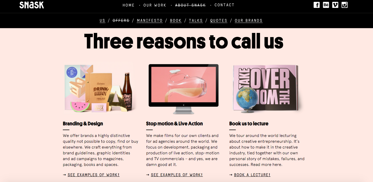
I find Snask a big inspiration as just looking at their work, website and manifesto you can tell they're laid back and comfortable with who they are as designers. This is something I hoped to also portray in ours.


The Snask manifesto consists of 10 commandments; I feel this is a clever way of making the manifesto less long winded and simple to understand.

My favourite of their commandments is 'just because you wear a black suit, doesn't mean you're a goddamn professional.'. I can really relate to this as I don't feel like constricting the way you dress is very creative at all and personally i'd much rather hire someone who looks colourful, happy and creative in their visual appearance.

 So for our manifesto we decided to create a similar tongue and cheek way of describing our values. I came up with the idea of 7 deadly sins, relating each to a creative aspect of our business.

Manifesto concept: Lust: I haven’t spoken to a real person in more than three days Gluttony: Putting Kale in everything Greed: I’ll have every coffee on the menu - I am going to use every colour in the palette Sloth: Netlfix and Baskerville Wrath: Overly twee design Envy: I really like that typeface, what is it? Pride: Posting work on every website possible

This is our initial notes for the 7 deadly sins, each one is funny and lighthearted but needed a bit of work to make them creatively relevant.


Lust: We lust over gorgeous, witty and well produced print, because let’s be honest, anything that has been created by someone getting their hands covered in ink is a good thing. We also lust over brilliant digital work. 

Gluttony: We have a massive appetite for inspiration, meaning we have to be constantly on the lookout for our next source of visual pleasure. We adopt a very free and open approach to research, idea generation and concept development.

Greed: We are not single minded in our creative vision or design process, allowing us to extract ideas from anywhere and everywhere. You could say this is greedy. We like to think of it as being eclectic.

Sloth: We are dedicated to producing work that challenges the conventions of contemporary visual communication. In order to do this well, we like take our time. We don’t enjoy rushing work that really excites us.

Wrath: We get very angry when aren’t being creative, because we don’t know anything better to fill our days with...

Envy: We don’t envy much, because we love doing what we do!

Pride: We are proud to be so diverse. Each member of the Screeeeen is an individual with unique stances and perspectives on creativity, which is what makes us so exciting as a collective. 

This is our further developed version of the deadly sins; they are much more creatively directed and tell you about who we are as a business. Although I do still thing they need working on further to make them shorter, snappier, more memorable and funny. I think a more concise manifesto will encourage people to read the full thing rather than getting bored.


~ Taking care of business - the concept ~


The development of a business 'brand' and concept began with the typeface. We consider ourselves to be different to a lot of design agencies are we are laid back, young and don't take ourselves too seriously. We wanted this to be reflected within our typeface. 

We chose Bluu Next as its not sans serif (which would suggest seriousness), the slab serif font is very different to anything we had ever seen and stands out among standard brands typefaces. Its also completely free to use commercially which gives us free reign for all our branding. It gives us an interesting and different look that expresses our personalities well.


I consider my main strength within the company to be screen-printing and similar analogue methods of printmaking; but I also enjoy digital design. This lead to the initial name idea of 'screen'; the concept being that we work both on a digital and silk based screen (multimedia company).

This concept was then developed further into the incorporation of 5 E's, one for each member of the founding business. Making our final name 'screeeeen'. 

The concept of the e's is something we can now take further throughout our brand, making clear seperations between each of our skills and showing how they all come together into one.

~ Taking care of business - Types of business ~

We decided to look at the types of business that can be set up as legally they all work differently depending on context.


Using the .gov website as a reliable source of information we explored each type to find what would be most appropriate to us. 

Our group consists of 5 of us, all would be working full time and accept equal amounts of work load and responsibility in terms of costing. 

We decided a limited company is the best approach for us-

The finances of the business are completely separate to personal finances - meaning if the business went under none of us would be personally liable to pay out

The business is run by 'members' each member accepts a percentage of responsibility for the company, allowing us all to equally own it rather than working below one person


~ Taking care of business - our roles ~

Members - Me, Amelia, Cameron, James, Tom

Name - Screeeeen

Study task - choose 5 areas the group as are good at that make us unique and individual to help us discover who WE are. 

We chose to join together as we observed a lot of businesses and even people in the class doing the same task were choosing other people with similar design styles and talents. In a bid to be DIFFERENT to other and stand out we decided our differences were are best quality, our styles are all completely individual which means we can offer clients a range of solutions and inspire each other to reach different outcomes. Initially we were nervous that this could cause disagreement but a few elements of core graphic design skills and interests means we have enough in common to work effectively and offer something new. 
  • Izzie - Screen printing is my main talent/main interest within the creative field. Screen printing is a cheap alternative to digital print. Screen printing appeals to the creative industries and people who are appreciative of hand craft/artwork as each peace created is bespoke and worth more. Screen printing is not as easily accessible to everyone making it more appealing. Not a lot of design agencies offer this alongside their work as usually work is digital then passed onto a printers, being able to offer this service to clients creates a personal bond between brand and the business. 


An example of a company that currently uses screen printing as part of its USP (unique selling point) is Print Club London. They offer screen printing services, classes etc. to creative people such as designers and illustrators. This is accessible to the public but more appealing to creative people, our company would differ as we could offer to do the prints for people. The other large difference is PCL specialise in screen printing but our company will be made up of other elements also; more of an all round group with different talents. 

  • Amelia - Logo design & branding
  • Cameron - Collage & pattern
  • James - Editorial design
  • Tom - Typography
Each of us having our separate roles is beneficial to the business so were not all trying to compete and confuse ideas over each brief. Things like idea generation, research and art direction will be a group effort and our area of collaboration.

Tuesday 2 February 2016

~ Creative report - questionare ~

I want my interview to be more like a fun and easy questionare that doesnt pressure the designer/artist into feeling un-comfortable in any way.


The book Wreck this journal came to mind when thinking about how to word/construct my interview questionares. The inclusion of areas for illustration and artistic expression rather than written answers is a fun way of engaging with the designers on a more creative level.


This is an example of the kind of spread included within the book.

Questions I will include within my interview publication are...

- If you could invent anything new what would it be?

- What is your favourite...
Colour?
Animal?
Number?
Way to cook potatoes?
Design programme?
Print method (screenprint etc)?
Flavor of crisps?
Brief you’ve done?
Client you’ve worked for?
Typeface?
Shape?
Genre of music?
Film?
Type of dinosaur?

- Is your design process tidy or messy?

- What is your design nemesis?

- Either or section...

- Would you hire someone who specialises in analogue print methods?

I want to keep the overall tone of voice really laid back with the odd comedic question or note from me.


This is my initial design treatment for the questionare, its nice and simple. A combination between the header type that I have created using a brush pen then scanner in and digital type to subtly express my competence in both. The idea being to print on multicoloured stock to create something bold yet simple.


This link is to an amended version of the publication, I felt the more professional digital type based aesthetic was more appropriate. This can then be printed on interesting stock to engage with the creatives on a level they will understand.

~ made you look & Kate Moross ~


I recently went to Hyde park picture house to see the art documentary film Made You Look. The film was incredibly inspiring to me as it discussed the differences between analogue and digital creativity. 

It discussed how within the internet age its the designers and artists pioneering analogue print methods and markmaking that now stand out. This idea appeals to me as in particular screen printing is something that has recently captured my heart. Screen printing is a way you can even combine digital designs and output them in an analogue way.

The film also re-introduced me to the creative Kate Moross.


This is an example of some of her most iconic branding work for Disclosure.


She is the owner of a London based business called Studio Moross. They produce all kinds of bright, colourful and engaging work; inclusive of all outputs (web, video, illustration, design, etc.).


I believe Studio Moross would be a brilliant place to conduct my creative report as they are all young, enthusiastic and interested in all types of media not just specifically graphic design. The team all have different roles within the business and possibly this could help me discover where I would fit into this type of studio dynamic. My main skills being analogue printing would this be something they'd be interested in?

- Important question "Would you ever be interested in hiring a creative specialising in analogue print methods?"

This is definitely the type of agency i'd love to be a part of as brightness, diversity and joy are all key aspects rather than a serious and 'business men in suits' kind of atmosphere.

They will be on my list of people to contact this year! 

Studio Moross
Studio 8
31 Jeffreys Road
London, SW4 6QU

0207 387 2600


Friday 29 January 2016

~ Creative report - saying hello ~

For my screen printed greeting I want to show all elements of my personality through a creative illustration. I've decided the typographic element of which will be 'hello' it's simple, friendly and can be sent to anyone as a way of making contact. 

Elements of my personality I want to express include 
- Happiness 
- Bubbly-ness (i'm very hyperactive and it's something I often express within my work)
- Dedication, if I creative something quite complex that is clearly took a long time it shows commitment, i'm not just after a minimal quick fix design outcome
- Friendly/outgoing, hopefully my keen-ness to contact him physically rather than just over email will show my general approach to people and design

So after hours of work....


then a few more hours....


This is the final outcome! It's a detailed illustration that includes lots of patterns and a few cheeky stick men, even an Adele (hello, it's me) reference. I think this is successful in portraying my personality perfectly and hopefully shows some of the skills I can bring to people as a designer/illustrator.

The next step is to screen print it, this shows diversity of media and that screen printing is a personal passion of mine shared with Pinky and other possible contacts I may send it to.


~ Creative report - making first contact ~

For my creative report i've chosen to contact Pinky Vision as he is local (Hull); the benefit will be ease of physically meeting him and possibly working together in the future. I find his work and practice really interesting so to question him would be really beneficial. 

Perviously we have contacted each other via Instagram, showing appreciation for each others designs posted via social media so I felt this could be a good point for first contact.


From this I received his email address; I plan to ask for a physical address to send actual work of mine. He works physically (screen printing etc.) so I want to send him work he will appreciate to create a lasting contact connection.

I've decided to produce a screen print greeting I can send to him and other potential contacts to show them my hands on approach to graphic design. This is an opportunity to show my skills illustratively also which is something I often don't get to express through all briefs.


Monday 25 January 2016

~ Artist research - Pinky Vision ~


Pinky is an illustrator/designer/graphic artist who's skills span across all different forms of media. Pinky inspires me as a designer as his personal process avoids digital form, his work is free flowing and positive. 

His overall inspirations and aesthetic is psychedelic, bright and happy; all of which I find really inspiring.


Many of his works can be found in the form of screen prints (both on paper and clothing) which he all personally produces then sells. This element of his process I find particularly interesting as screen printing it's something I hope to do regularly throughout my design career as its really hands on and enjoyable. 


His designs also often take the shape of wall murals, these are highly impactful and completely change communities. It's something im personally yet to try but I really want to experiment with.


Pinky is a designer i'd love to work with in the future as his process and outcomes are really interesting and use hands on techniques i'd personally find to be fun. 

As part of this brief and for future contact I will send him some questions and personal work of my own.

The main thing i'd like to learn is how he makes money from screen printing and physical work as its a tricky market to break into. Hopefully he will inspire me with his knowledge and I could even ask about interning with him over summer.