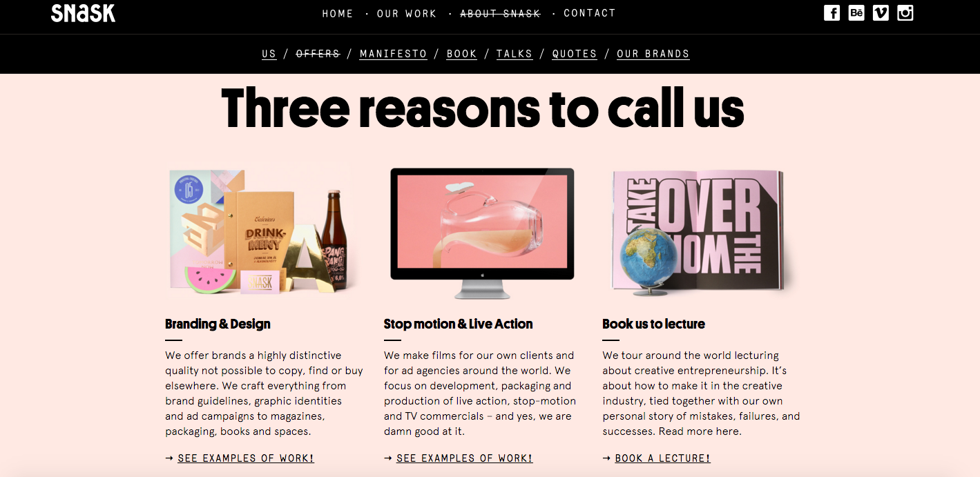
Similar to Snask's approach this idea could then be taken further so that each e represents a service we provide for clients.

Due to my interest in illustration and markmaking techniques used within design I decided to illustrated within the template of the letter. The illustrations show my imagination and personal style well.

For the final execution I vectored the illustration and made it orange; orange showing my happy and outgoing personality and injecting some colour into the design.

Each of us created our bespoke e designs expressing the way we work; giving us a range of digital, hand drawn and printed styles. This has then been partnered with a small description of the areas each of us specialise in. In theory each of these could be on the website and when clicked on link to a more descriptive page about each of us and the things we bring to the business/services we can provide.

I also took each of our designs and made them into a gif, this could be posted onto social media and web platforms to effectively show our diversity as a collective of creatives.
No comments:
Post a Comment